
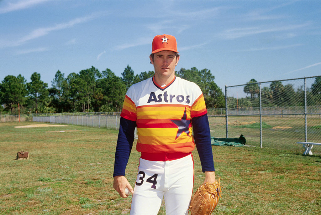
Source: C. 1980s Nolan Ryan, Houston Astros pitcher. (Bettmann via Getty Images)
America’s pastime, baseball, is back! Long summer nights at Daikin Park, walk-offs and Crawford Sausage Dogs paired with ice-cold Crawford Bocks are ahead of us, and we should all be thankful for it! In honor of the return of the MLB regular season, here’s every Houston Astros uniform ranked.
Related: 25 Forgotten Hair Metal Songs That are Awesome
Related: 20 of the WORST Albums Made by Rock Legends
Related: Price Of Beer At Every MLB Stadium
Related: Top 15 Best Fights In MLB History
Baseball is Back: Here’s Every Houston Astros Uniform Ranked was originally published on 93qcountry.com
1. 1976-86 Rainbows
Was there any other choice? The star and number on the back gain white outlines in 1982.
2. 1975 Rainbows
3. 2016-Present Navy
The Astros have done what few franchises in pro sports have achieved in the present day; wearing great uniforms with a fantastic color way that represents the franchise and city well across the board.
4. 1976-93 White, Gray & Cream
Whites were introduced in 1981 was an alternate. The grays were phased out for creams in 1982
5. 2013-Present Orange
The 2013 Astros-brand redesign honors the franchise’s past with its color way and elements of the uniforms’ design, while feeling fresher than ever.
6. 2013-Present White
7. 1962-64 Houston Colt .45s (Home)
Used as the home uniforms before the Astros were the “Astros.”
8. 2013-14 Navy
The predecessor of the present day navys. The only difference is the use of the modern Astros logo instead of “Houston.”
9. 1965-70 Home

The darker lettering a star look a lot better than what proceeds these uniforms.
10. 2022-24 City Connect “Space City”
Nike’s City Connects haven’t been “home runs” in the MLB, something the NBA has experienced across the board with their non-home and away uniforms (the City Editions are typically terrible), but the Astros lucked out with the “Space City” uniforms.
11. 2013-Present Gray
12. 1962-64 Houston Colt .45s (Away)
Can’t go wrong with a classic look. The features on these uniforms have inspired decades of Astros uniforms.
13. 1965-70 Away
14. 1971 Home

15. 1972-74 Away
16. 1972-74 Home
17. 2025 City Connect “Stros”
Elements of these are good, but they aren’t as good as their predecessors. The logo on the front is a nice callback to the 1990s, and a direction we wished ownership at the time headed in colorway-wise.
18. 1971 Away
19. 2000-12 Pinstripes
Is it a rule in baseball that every franchise must attempt pinstripes at some point?
20. 2000-01 Away Black

These don’t scream “Astros” to me, which is why the black uniforms are this low. Otherwise I like the design.
21. 2000-01 Home Black

See No. 20.
22. 1997-99 Gray
Better than they were in 1996, but still not great.
23. 2000-12 Gray
24. 2002-12 White
25. 1997-99 Navy
26. 1994-99 White
27. 1994-96 Gray
28. 1994-96 Navy
29. 2001-12 “Houston” Red
Why red?
30. 2002-12 “Astros” Red
31. 2000-01 White

Never have been a big fan of logo-only front designs on uniforms, especially ones this simple.